Visual Design for Participatory Art Festival
A a founding member of the team putting on the Something Else festival of participatory art, I contributed every way that I could. Here, I will review the visual design work I did on the event's map, website, and branding.
Our goal was to spread the word about our dinosaur themed arts and craft focused Labor Day weekend party. We needed all the basics: banner, slogans, website, and newsletter. The target audience was adult, whimsical, and easily distracted. So we played to that!
- Role: Graphic Design & Web Development
- Client: Something Else
- Tools: Sketch, HTML/CSS, Google Sites
- Duration: 6 months
- Year: 2018-2019
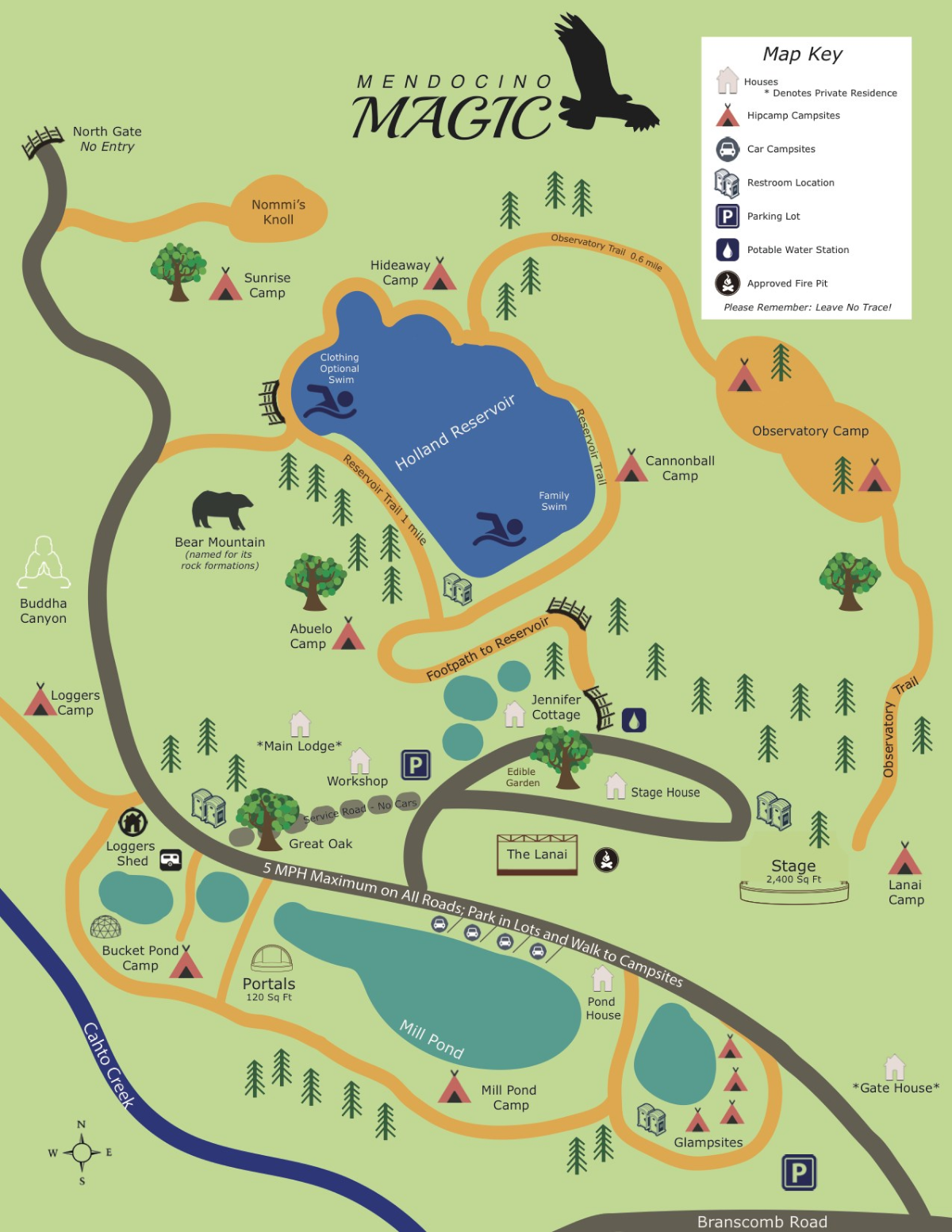
The venue's original map. We found this a bit too childish and also noticed a number of significant inaccuracies. Since this map was just a flat image file, we needed a proper asset to modify and improve it.
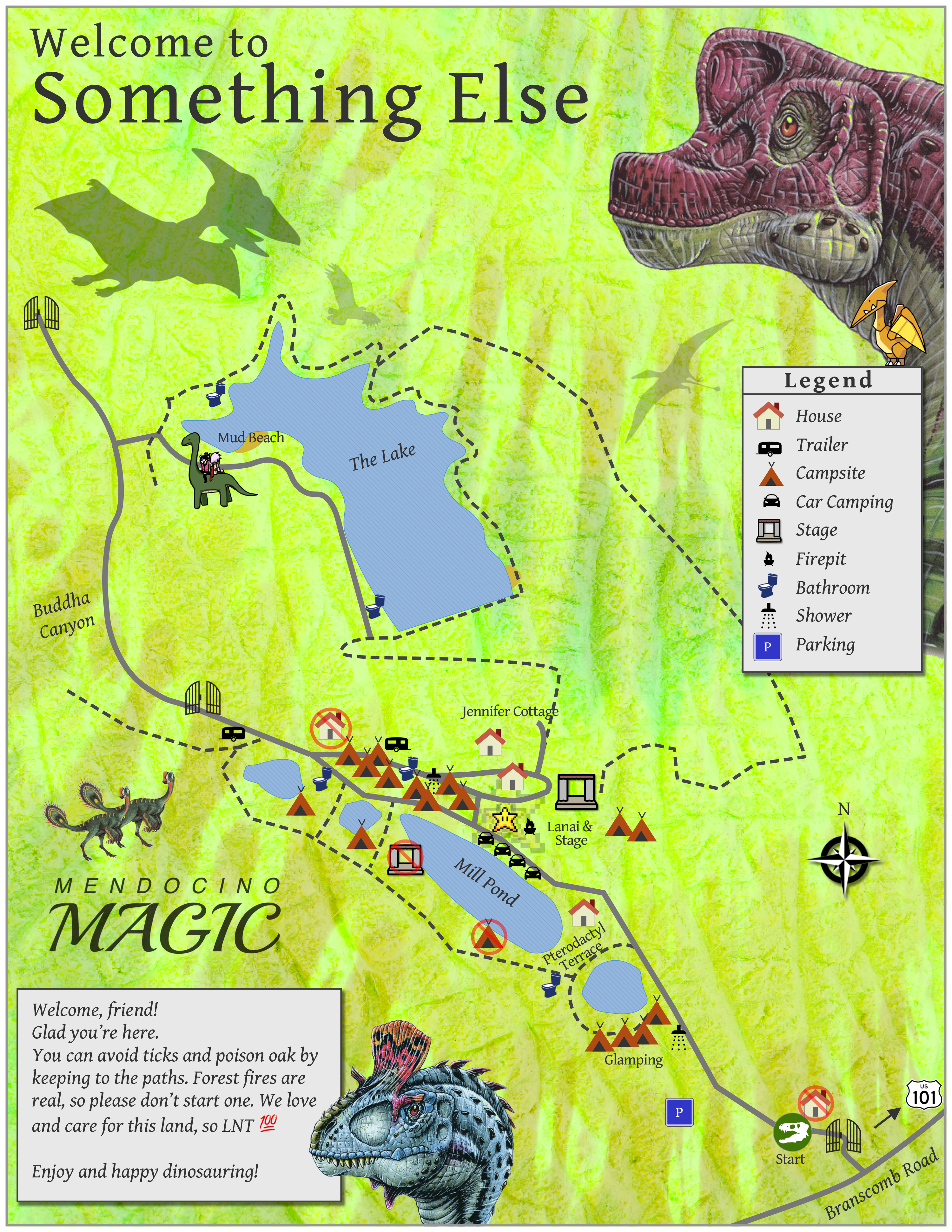
I put together this map in Sketch to accomplish specific objectives: show (or hide entirely) prohibited areas, foreground our central and peripheral sites, and inject a fun dinosaur flavor as per the event's theme.
The map comes on a standard 8 1/2 by 11 sheet of paper. But it only uses the front of the sheet. On the back, we copied some of the (rather unappealing) warnings and information from the venue's materials. And we spiced them up. This turned out to be a great way to disperse critical messages about responsibilty to people who are just trying to have a good time.
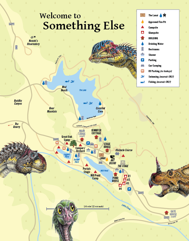
As a result of our work on the map, the venue decided to change its standard map and contracted with another founder. Here you can see her final deliverable, featuring a number of design elements from my version including the dinosaur theme (which she removed for the venue), narrower lines for roads, more active whitespace, clearer gate and restroom icons, and added emphasis on landmarks such as houses.
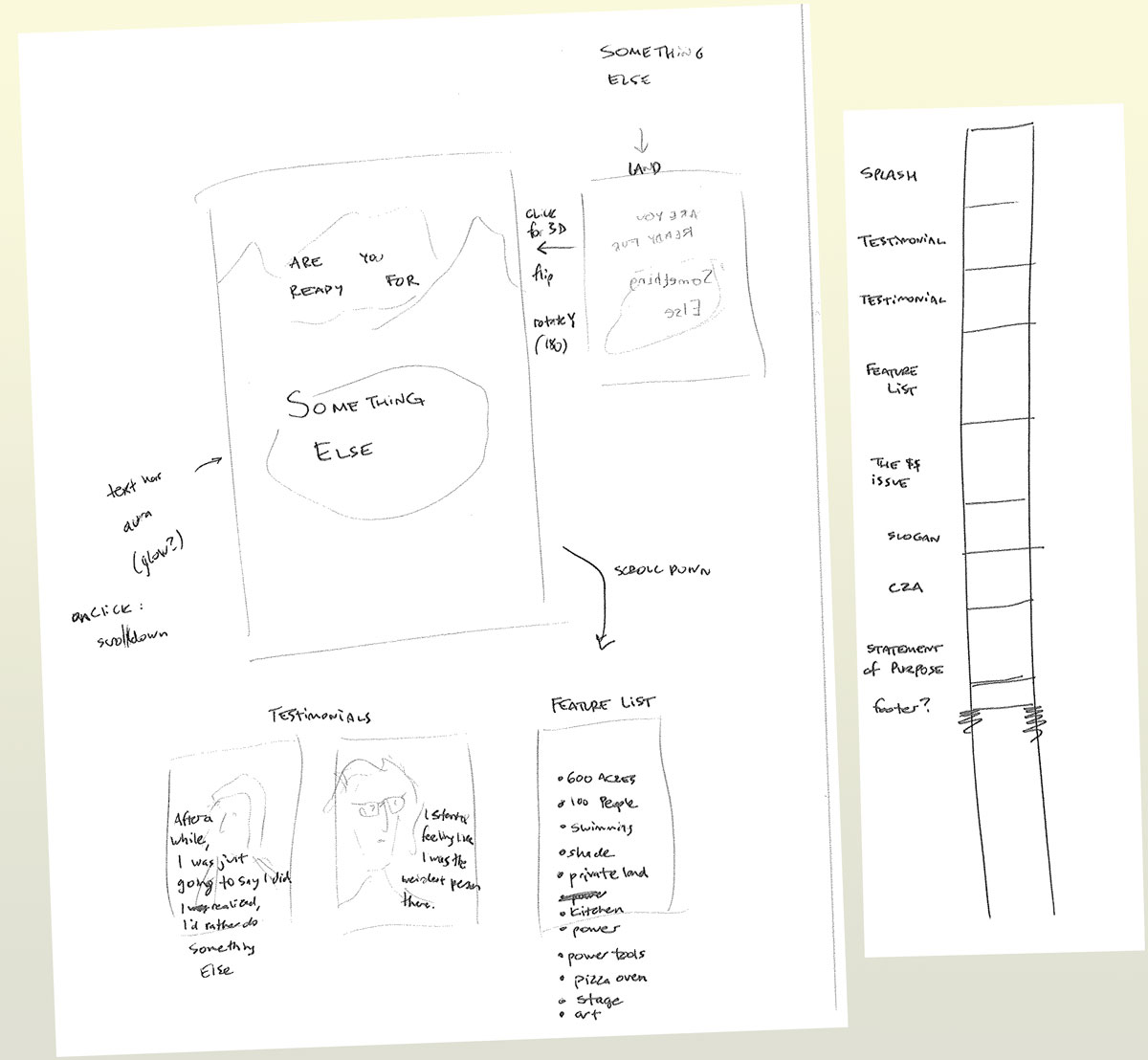
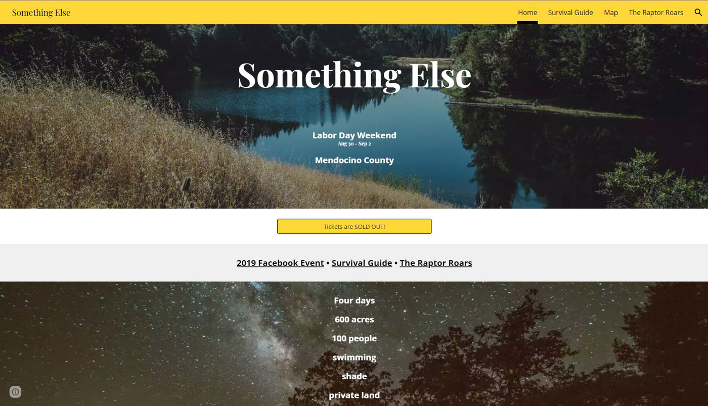
The event also needed a website. This served primarily as a portal to buy tickets, but also quite importantly as a central space to answer all questions for interested prospects. This early design sketch showed the essential elements we wanted, including testimonials, a feature list, a strong call to action, and clear statement of the festival's purpose.
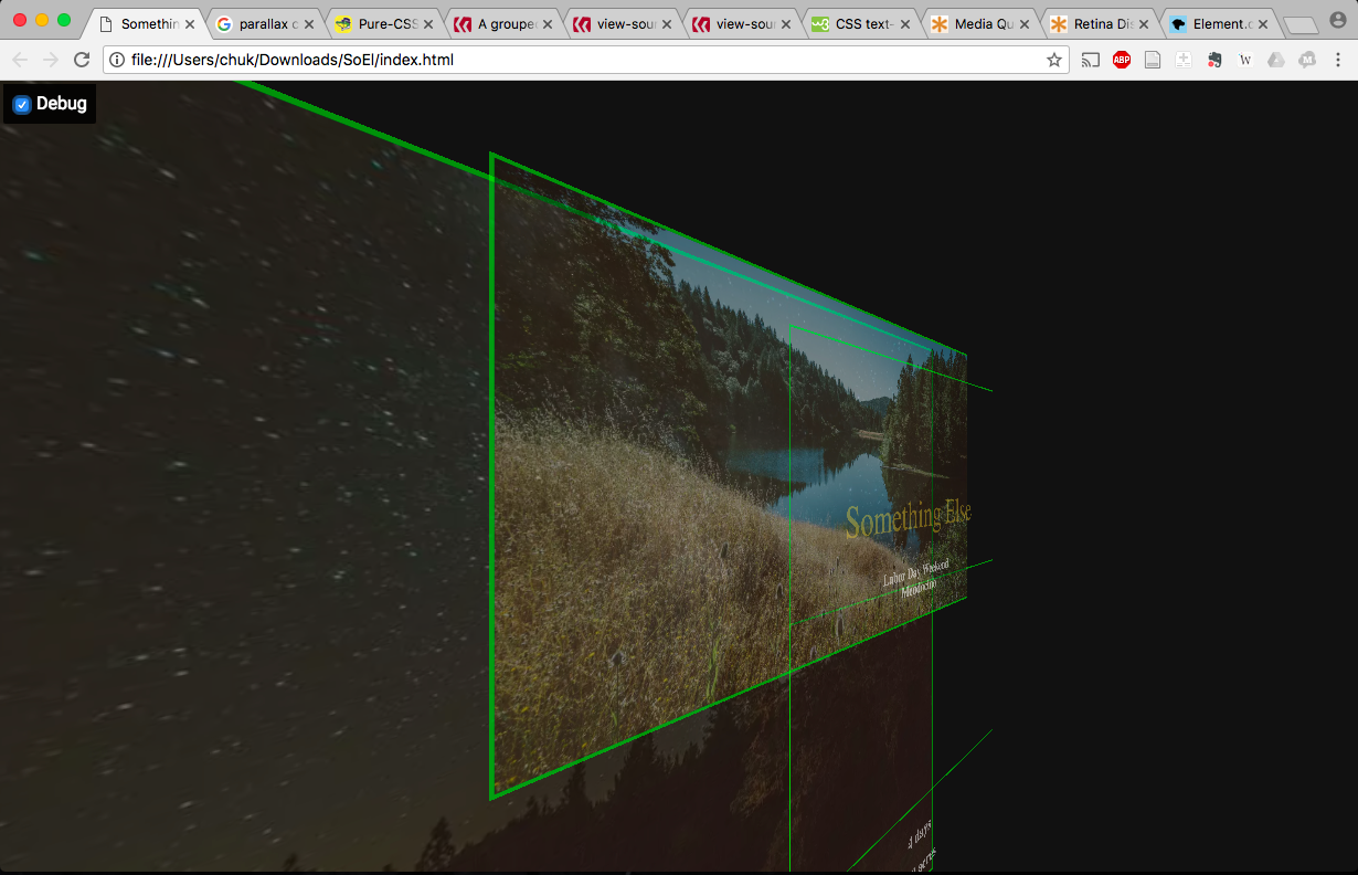
After trying out SquareSpace for an off-the-shelf solution, we decided to write up the whole website from scratch to get the flexibility we wanted. Here, in a debugging view, you can see the 3d layer groups I included in the site's css to accomplish the parallax effects we wanted. This version of the site ended with a simple lead generation form, as we were not yet ready to sell to the general public and wanted to vet our guest list.
For 2019, we decided to approach publicity differently, building interest through semi-public Facebook groups. We also had more collaborators and so I rebuilt the site in Google Sites simple because it would be the most easy CMS for collaborators lacking web development skills. Ultimately, this was a huge advantage because we easily merged in a PDF on what to bring and what to expect into the Google Site and had volunteers upgrade, edit, and expand the document.
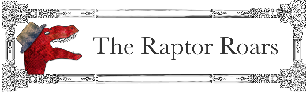
We also wrote a monthly newsletter leading up the event and I developed this cute banner for it, to justify its title and push whimsical vibes on the readership.